Sunday 26 October 2008

Nigel Parkinson a fun comic artist for today


This one made me laugh out loud....it is soo funny.


Here is the moment when the Dandy changed. Each week the man Nigel drew would take down a letter of The Dandy. A fun idea. The Dandy changed to a more glossy paper and new characters joined. Last year The Dandy has changed again to Dandy Extreem with more features and less comic pages. Personally I prefer The Dandy has a comic than a magazine/comic.


Click on all images to see in full..

I like Nigels work a lot. He has drawn Bea, Dennis the Menace and Gnasher, Cuddles and Dimples, Bash Street kids singled out, Lord Snooty the Third etc..also Rats and others for The Beezer annuals. He has drawn or ghosted in The Beano and Nutty in the 80's...for example some of Roger the Dodge Clinics problem section..normally drawn by Robert Nixon at that time.
http://en.wikipedia.org/wiki/Nigel_Parkinson

Nigels big break was with Bea in the late 90's Beano Dennis the Menace baby sister.

I love his Cuddles and Dimples strip best in The Dandy...Started in the issue you see above..(before that drawn by Barrie Appleby who draws Roger the Dodger today)...it works for adults as well as children...as the parents are also featured strongly. Also the Mum is hot!!:))

The colouring on all thses are unusual and stand out. Its beacuse they are coloured with felt pens..which give a great effect. Computer colouring is mostly used today...But pens seem to have a more personal touch..great shading effect. He is good at not going over the line.. I think I like the pen effect so much has it reminds me of The Mr Men by Roger Hargeaves...it gives the child the impression that he or she can do this as well.

Nigel is great at the crowd scene..the busy picture...he has done some great posters.

Nigel is also great at the splat!..splash!..Splosh!.splish! etc...I would say its his trademark.
His characters are always making a mess....splashing through puddles...landing in ponds...cakes going into peoples faces..mud sploshing up..great action scenes.

Another fun trademark is the many signs he puts everywhere throughout the strip..the more the merrier I say.

Cheers to Nigel.....I'm a fan!:)

http://thelittlechimpsociety.com/theape/lcs-interview-nigel-parkinson/

http://itn.co.uk/tags/nigel_parkinson.html

Saturday 25 October 2008

A Tribute to Les Barton


Cor!! 1970.


Both from Whizzer and Chips annual 1973. Click on images to see in full.

Les Barton has died But like Ken Hunter he has left us with a wonderful comic legacy.
See I Spy and his other work by clicking the label tab Les Barton below for other posts I've done on Les.

Lew Stringer, Down the tube and Bear Alley blogs have also done tributes.
http://www.comicsuk.co.uk/Forum/viewtopic.php?f=1&t=2301

Cheers to Les.
Thank you.

Ken Hunter what a great comic legacy


Beezer 1970. Click on image to see it in full.

Ken Hunter has died last Monday morning, living a full life and reaching 91 years old.
My prayer are with his family and friends at this sad time.

http://www.comicsuk.co.uk/Forum/viewtopic.php?f=1&t=2302&p=17658#p17658

To see Ken's amazing comic work use the label tab marked Ken Hunter below to see The Jellymen, Danny's Tranny and many more.

Cheers to Ken.

Friday 24 October 2008

Dudley D Watkins King of perspective


click on both halves to see the whole page in full.

Every panel is full of depth...height...different angles..depth...and fun!

The last panel with all the item Mickey climbed is a great payoff.

Perspective should be used more in comics. It is so powerful.
Also the use of distance.

So get your rulers out..

Monday 20 October 2008

Black Bob by Jack Prout


What a great artist Jack was.....lets have a closer look at this Black Bob strip from a 1961 Dandy comic.

The first frame shows a good white space....its very easy to fill up a picture with lots of hatching and detail..very hard to leave space...making it easier on the eye. The wording Black Bob stands out despite a dark black background and black letters...great face on Black Bob being cheeky and sticking his tongue out.

Frame two a nice mirror image of the man and Black Bob running out of view. The angle has changed in the picture. Also looking down on the image.

Frame three has wonderful brick work...no short cuts every brick is different. Lighter hatching and darker hatching by pen to different degrees. Nice wooden door effect.

Frame four has good distance with smaller bricks on the stable. This is very tricky to do. Also a good sky downward at an angle strokes. Darker bricks to show shadows.

Frame five nice use of action white lines to show the barrel rolling.

Frame six great wavy line wool effect on the ram.

Frame seven A different sky...Jack always making everything unique.

Frame eight shows lovely pen work on the corn...he really knew what each of these objects looked like...really has studyed it...not second guess..

Overall an amazing piece of work...very carefully done...no rushing...


Saturday 18 October 2008

An early Mickey the Monkey by Dudley D Watkins


a quote from Spy
--------------------------------------------------------------------------------
WHAT A DIFFERENCE seeing the real Mc Coy like this: 'CLASSICS from the COMICS' does this work noreal justice.........many thanks for seeing these excellent historical works, PETER......
from Beano and Dandy forum..
http://tiptopgolfy.proboards101.com/index.cgi

I agree with Spy its great to see these images as large and in colour. With all the detail intact. Some of the red wording or anything red is lost in the black and white of Classics or Best of Topper.

Studying the picture.
Dudley is great at making the picture alive. So many angles like top or bottom point of view. Also characters going in and out of the frame..perspective. If I was drawing this I would of made it flat...left to right...But Dudley has inspired me with his depth he has in each frame...nothing is flat!!! Every frame is different another amazing thing. The wheels on the chair are different each time the same with the open book...different angles a real feeling of movement (frame 7,8,9). I love frame 10....Mickey coming towards us...figures in background. Frame 4,5,6 is great animation of someone swimming. Also the room slowly spins at the same time of the push off by Mickey.

So much in one page to study and learn.....also to laugh and admire.

Monday 13 October 2008

Frank McDiarmid's first comic work


This is from 1958.
Rummy Rhymes and Quick Slick is also drawn by him.
Our Ned is drawn by Albert Holroyd.

Frank started the puzzle page in October 1957 Beano.

Thanks to the Hisory of The Beano the story so far...I'm learning who drew what and when. Amazing Frank has been in the comic business so early...who later drew Cheeky in Cheeky comic.


Considering it was a hot sunny day I did well at the craft fair in Woking......earned £39.
I like the idea of my cartoons on someones mantlepiece being enjoyed 8) ..
Also gave out all my cartoon business cards.
So a good moral booster.

Saturday 11 October 2008

Dudley D Watkins Adventure books in picture form.


These exciting books are brilliantly drawn in picture form by Dudley D Watkins. It really makes you want to read the actual book. These were not only in the 50's Topper But also shown in the Weekly News also in published books. Love to see these reissued in the Weekly News or in book form again.

My craft fair is tomorrow at Woking sports centre all day. See you there...with lots of cartoon Birthday/Christmas cards drawn by me and the chance to commission me for any cartoon work needed.

Tuesday 7 October 2008

Beano book 1960-69

Not my favourite it is too realistic. Almost spooky. The eye lashes etc..its very creepy.


Very simple drawn by Dudley D Watkins. Nice the use of the B used in both words. This looks like Biffo.


A nice swinging image. Again the character is reading the actual book.
Very 3D looking almost puppet like. A nice use of the lettering..holding the swing up.


Nice use of a heavy hadow on Jonah drawn by Ken Reid. I think it was coloured by someone else has Ken wasn't well in this period. The laces are almost dancing along with the jig. Again very hyper real. It really stands out. Even the Beano wording is sinking down with the ship. I like the hat reasing on the word Book.


Theres lots of great touches in this image. Like his vest stuck in the mast. The clothes jig along to the music..nice colourful notes..


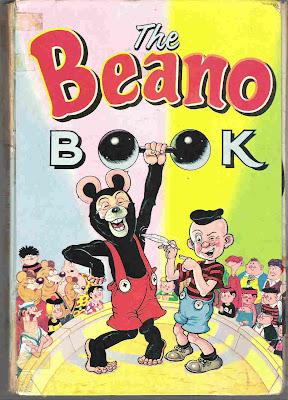
Biffos nose looks very strange almost dog like...its almost as if he is wearing a mask. Nice use of the dumbbell as the letters 'oo' in Book.
Nice colour stripes for the background like a circus tent. Biffo is almost leaning on the strongmans head!!


Biffos face have a Mickey Mouse quality..I like the use of bluey grey on the ears and eyes and a light slit in the eyes..it is great seeing the early Bash Street kids in colour...theres the teddy boy Bash Street kid..and the almost normal Plug. Its a strange image of a picture within a picture..teacher reading the actual Beano book in a jigsaw. So many levels. The colours and drawing really have an old feeling to it.almost 30's feel its that green colour...love this image..

The teddy boy on the front cover of the beano book was called teddy fancy that! and he was with the bash street kids from 1/9/56 to 8/10/60

dandy mad
It was Korky artist James Crighton who drew the cover for the Beano book 1960 and his last.


Thanks dandymad from comicsuk forum for the info.
from
http://www.comicsuk.co.uk/Forum/viewtopic.php?f=7&t=2251

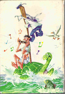
The back cover is very bizarre...the images are all mixed up...with a very realistic Dennis arm and hand highlighted in yellow. Dennis and Little Plum in skirts...or leave skirt...the character Dennis is mixed up with is a Black native character Pom Pom drawn by Gordon Bell in the book. The head of Pom Pom is on Little Plums legs and body...black and white mixed up. The cats head is from Kat and Kanary strip..the Kings body is Prince Whoopee...Minnies skirt is on Little Plum...


Comicsuk website has all the Beano annual covers to see..

Saturday 4 October 2008

Beano book 1976-79


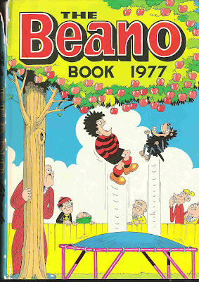
The bouncing goes with the bouncy clouds. Also love the Beano book wording being put behind the image. I like the fun 70's toy being used, also the face on it of Dennis the Menace. Good use of red throughout. I like this one best out of the ones shown here.


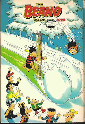
Interesting angles used on both pictures..good choices. A lower angle for the rolling snowball coming towards us and the characters. You can see undernesth there running boots. Then a high view to show the tree and the characters laughing. You can see the top of Lord Snootys Top hat. Also they are shown looking back. Great contrasts.

lovely clouds formation on each of these images. Every Beano book title font was different from the next. Coloured depending on the main colour of the picture.

Friday 3 October 2008

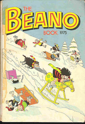
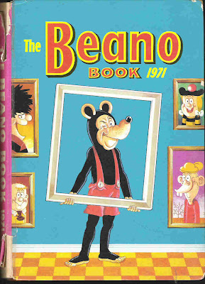
Beano book 1970-75


The way the kids are drawn in different falling angles gives it a real 3D quality. Very hard to draw!


The shininess of the frying pan is great..


There seems to be a battle between Biffo and Dennis the Menace...same thing happened in the early Beano annuals between Big Eggo and Biffo...have a look for yourselves at comicsuk.co.uk annuals section under Beano. Enjoy zooming in!! Good shadows...especially on Biffos shoulders. Again makes it more alive..


My favourite Beano book cover. You can really see the paint colouring. Its fun seeing what eye colour they are. Fatty has blue eyes!
Billy Whizz is fun...his whizzing smoke sure saves the artist a lot of drawing loads of feet!!


You can really see the juice of this lolly...lovely idea..yummy!
Also great looking grass details. Like this one a lot!


It is nice to see these images large. A lot of websites on comic annuals show them very small...you miss such a lot of detail that way.